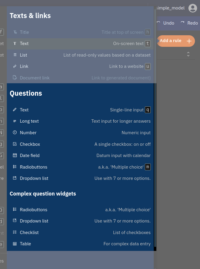
Input Types
In a web form, there are various input types that allow you to enter different kinds of information. For example:
- A date input lets you choose a date from a calendar.
- A number input is used for entering numerical values.
- A text input allows you to type in words or sentences.
- A dropdown menu lets you select from a list of options.
These different input types help ensure that the information you provide is in the correct format and makes filling out forms easier and more efficient.
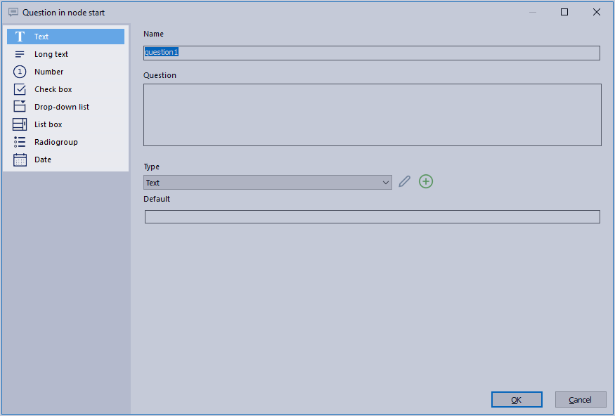
Whenever you create a new question, you’ll have several options (see picture below).
The input type determines how the question is presented and what subtypes are possible.
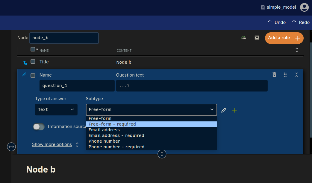
For each input type, there are some predefined subtypes to be chosen from. This is shown in the picture below. Each subtype has its own set of properties, mostly having to with constraints on user input.
When you select your input type, you can select the subtype. This is highlighted in the picture below.
For instance, when a type is ‘required’, it means that the user cannot continue without filling in the required field.
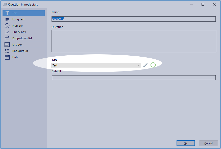
These subtypes may be inspected and customised via the pencil and plus sign buttons next to the Type drop-down; for more on that see custom input types.
Pre-defined subtypes (per input type)
The various pre-defined subtypes for the different input types are discussed below in short. Use this section as a reference if you ever need any specific type or if you just want to know what options there are.
Note that the web and the desktop defaults differ. Some have to do with having better (more humane) naming. Some have been removed, such as countries of the world, because in the web version it has been made easier to copy and paste lists. And Gender has been removed because we really shouldn’t ask that without good reason, and therefore should not be present as a default list.
When importing a model made with the desktop version to the web, old subtypes are preserved.
 Text
Text
Choose Text to let the user give a short, single-line, textual answer. You could, for example, ask for someone’s name.
- Email address
- This type checks whether or not an email address is filled in.
- Postcode
- This only allows user input in the form of a Dutch postal code.
- Standard String
- Standard text input. Limited to 50 characters.
- Telephone number
- Allows a user input consisting of 10 digits.
- Text
- Standard text input. Limited to 255 characters.
 Long text
Long text is comparable to ‘Text’. However, it allows the user to give a lengthier, multi line, answer. Use long text to give the user the opportunity to give an explanation.
- Memo
- The standard type. No character limit.
Number
Use this for numeric user input, such as questions related to money, weight, amounts. If you want to allow the user to use decimals, choose ‘Number Precision 1’ or ‘Number Precision 2’.
- Number
- Enter a number without decimals.
- Number Precision 1
- Fill in a number with one decimal.
- Number Precision 2
- Fill in a number with two decimals.
Checkbox
A checkbox gives the user the possibility to ‘check’ something. A box that has been checked translates in the model to the number 1, an unchecked one to 0. This can be useful in conditions. Note that if you want to use multiple checkboxes, a checklist is advised.
- On / Off
- A regular checkbox without conditions.
Date
This allows the user to fill in a date, by keyboard or with a calendar.
- Date
- Allows the user to fill in a date.
Dropdown list
A dropdown list is a way to choose one option from many, but it saves space and keeps things tidy until you need to make a choice.
This type will present the user with a dropdown list from which they can pick a single item. This is especially useful for larger (custom) lists.
You can also check the option ‘Free text’ whenever you pick a dropdown list. This allows users to enter free text instead of picking one of the options in the list.
- Yes / No
- Allows the user to choose between ‘Yes’ and ‘No’.
- Yes / No / I don’t know
- Allows the user to choose between ‘Yes’, ‘No’ and ‘Don’t know’.
- List
- An empty type. You can use it to create your own.
- CountriesOfTheWorld_NotNull
- Let’s the user choose from all countries of the world. It is required, so the user has to pick one.
Radio group
A Radio group will present the user with multiple, always visible options from which you can choose only one. Each option is presented with a small circle next to it. This circle is called a “radio button”. When you click on a radio button next to an option, it gets filled in, showing you’ve selected that option.
As a rule of thumb, use a radio group with up to 7 items, beyond that, opt for the drop-down instead. Use a checklist instead if you want the user to be able to check multiple items at once.
A radio group shares its subtypes with a drop-down.
List box (desktop-only)
A list box will present the user with a list of options to choose from. Compared to the drop-down list, a list box is always shown completely.
A list box shares its subtypes with a drop-down.
Not included in the web, because it’s a strange widget often hard to understand, wich we already advocated against in the old days. Use a radio group instead.